Our primary design goal while designing Airship is that simplicity is key. Designing a simple, intuitive user interface requires thought, discussion, arguments, mockups, wireframes, iteration, improvements, process, and lots and lots of feedback.
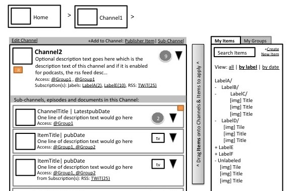
Version 1 – Key screens
Airship began as a discussion nearly a year ago with a very simple premise: what if we built a content management system that focused on user-friendliness and simplicity, removed terminology such as RSS, syndication, subscriptions, shows and episodes? In essence, all of the domain-specific cruft that was baked into the old, podcast-focused Mediafly Publisher? The first designs based on these discussions showed huge progress from Publisher.
They were static designs that didn’t clearly show how a user interacted with the system. After reviewing these designs with external users, it became clear that:
- While we were headed on the right track, things were still too complex. Some domain-specific concepts such as RSS made their way back into the mockups.
- We need to mock up the full set of interactions, not just a few key screens
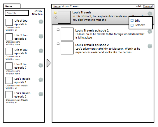
Version 2 – Full interaction
The results were significantly improved over Version 1… but not yet where we wanted to be.
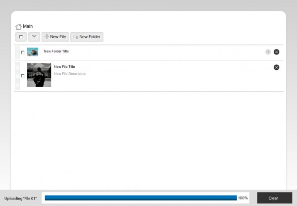
Version 3 – Even simpler
After learning a lot from Version 2, we decided to go even simpler. With version 3, we pared down the interface even more. We ripped out everything that wasn’t critical to delivering a fast, easy to understand user experience. The result starts to look even more like the Airship of today. Notice the modern gradients on the buttons, clean thumbnails, drag-and-drop handles, and clear delineation between folders and items.
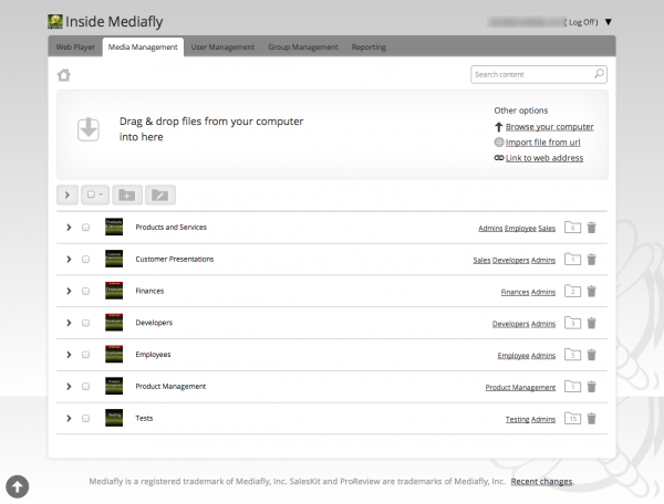
Version 4 – Go live
- Built the system, comprised of the API and front end
- Tested with users
- Repeat a couple dozen times or so.
The simplicity, cleanliness, and power of the UI speak volumes. After a walkthrough with one of our customers, a hush fell over the audience. Then one of them said “Wow, that is like a breath of fresh air compared to the SharePoint interface that I stare at all day.”
If you’d like to learn more about Airship or how it can help your organization manage media and sell better with iPad and other smart devices, please feel free to contact us today.


Comments are closed.