At Mediafly, we always want to be ahead of the curve in how we help our customers and how we position ourselves as thought leaders. A large part of maintaining this momentum revolves around being adaptable and knowing when to make a change. In the latter part of 2013, it became clear that our brand, visuals, and messaging, needed a facelift.
Back in January, our journey began with our executive team’s decision to implement a new strategy & position on how we can fully assist our clients (and potential clients) tackle their enterprise mobility challenges. Through this process, we discovered that Mediafly is the content mobility cloud and, consequently, came up with an all-encompassing phrase describing who we are:
“We provide technology solutions that deliver unparalleled interaction with your company’s content, on any device”
Just as the visual side of a brand isn’t complete without messaging to back it up, the messaging & positioning side doesn’t work if the visual brand isn’t consistent. While very fond of our logo, it was beginning to look a little outdated; newer logos were simpler and our old one still featured the RSS symbol – something we hadn’t done in a very long time. Furthermore, we decided that our colors & fonts needed to be more sleek and modern to fit the style that Mediafly, as a company, encompasses. More than just visually appealing, this style fits entirely with the cloud computing space that Mediafly is a part of.
![]()
So, how did we figure out a style we collectively liked as a company and that could fit within our industry? Like any visual branding process for a client, it started with research. It’s not necessarily what the designers, who are essentially in a supporting role, want – it’s what the client (in this case the company as a whole) wants. Finding out what we liked in a brand, reading between the lines, keeping a conversation going, and providing suggestions & expertise lead us to a light, modern brand that works and is uniquely ours.
After sending out an informal survey to members of the Mediafly team asking which brands & websites they liked (and looking through my email to find sites/brands that had been sent to me as examples in the past), I narrowed down a list of twelve sites to analyze. I spent the first chunk of this project searching for common threads among these favorites: grayscale palettes with one pop color, minimal logos primarily made with distinctive typefaces, and light typography.
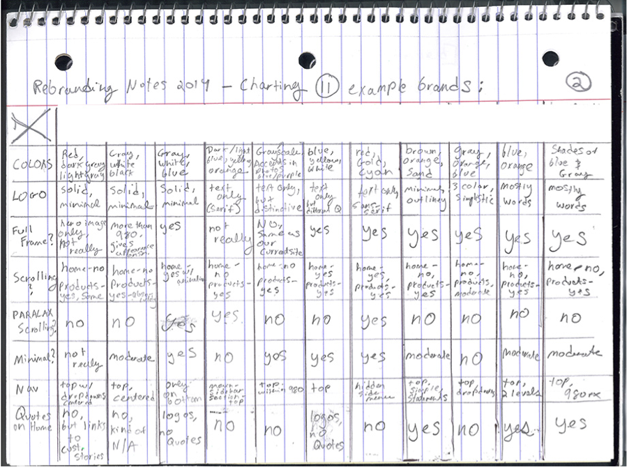
Research Example
I then shared my research with other members who essentially became part of the “Mediafly visual re-branding team” – comprised of individuals from Sales, Marketing, and Product. – and came up with several brand mockups to eventually amalgamate. During this part of the process, we really stretched our legs and came up with brand-designs that were all over the map.
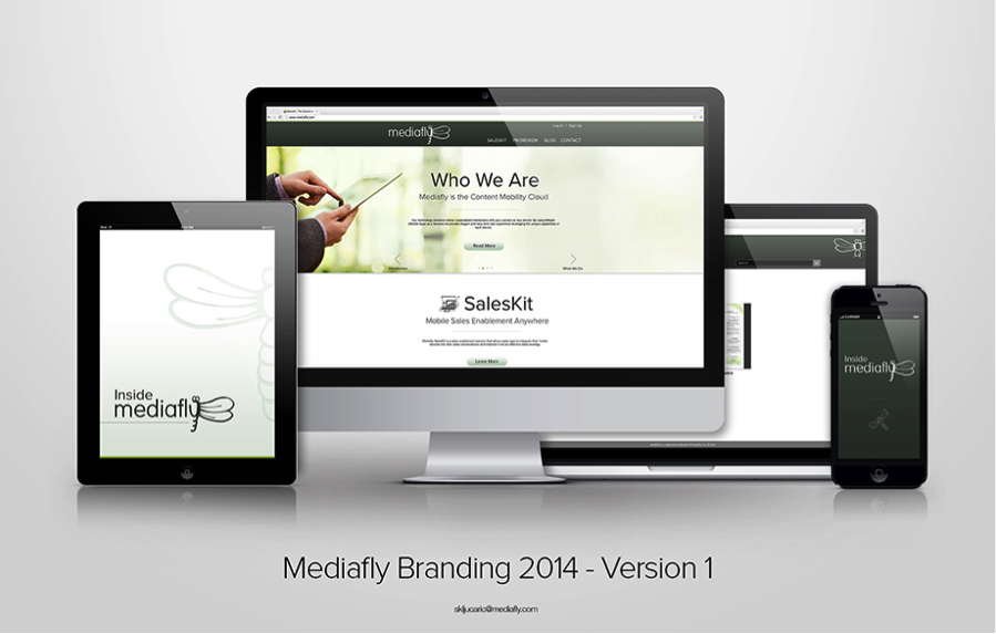
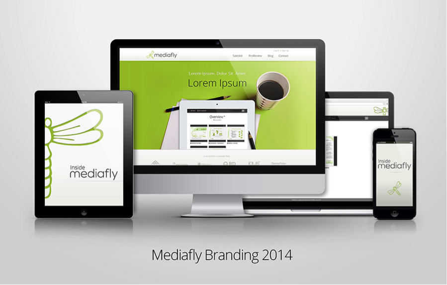
Example of early brand
The visual re-branding team spent a lot of time carefully choosing bits and pieces from these brand designs for a final presentation to the executive team. With a few 11th-hour changes, we finally settled on a new visual identity we could all be proud of.
So through all of our research, conversations, and revisions, we have accomplished creating a visual identity that matches our new messaging and vision. It’s light and modern like our favorite brands but unique to us. It truly was a team effort and every member – from those who shared a website they liked with me a year ago to those actively mocking things up in Photoshop – made a huge difference.
Make sure to check out our new site!

Comments are closed.